Building a Dashboard You Will Actually Look At
Most dashboards are built once, admired, and never opened again. The ones that survive answer a question their owner asks every week.
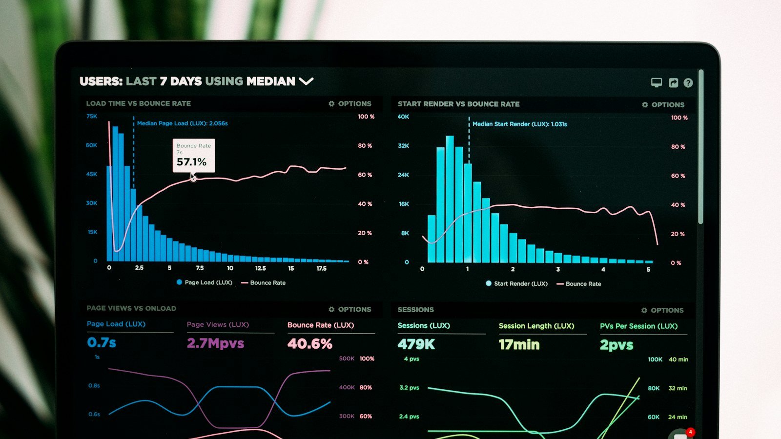
Insights Studio lets you build dashboards of tiles over your cases and their tables — charts, KPIs, grouped tables with subtotals, timelines, maps, idle-case alerts. It is a powerful thing, and power is exactly the problem: the first dashboard most people build has fourteen tiles and answers no question anyone actually asks.
Start with the question
Write down the three questions you ask yourself on Monday morning. Not "how is the business doing" — the specific ones. "Which cases have had nothing happen for two weeks?" "How much rent is overdue and on which units?" "Which investigations are due this month?" Each question is one tile, maybe two. Build those. Stop.
The tile types that earn their place
- Idle / gaps — cases with no activity for N days. The single most useful tile for anyone managing a caseload; it finds the matter that fell between two people.
- Number / KPI with a "higher is good" or "lower is good" — overdue balance, open requests, days to completion. One number, coloured by whether it is going the right way.
- Table grouped with subtotals — rent by building, spend by contractor, cases by worker. Export to Excel when someone asks for the workings.
- Timeline — what is due when, across the filtered set.
Bar and pie charts are fine for the quarterly review. They are rarely what makes you open a dashboard on a Monday.
Scope it
A dashboard has its own filters: section, template, status, date window, owner. A dashboard scoped to "tenancies in Building A, In progress" is useful to the person who manages Building A. A dashboard over everything is a poster.
Home widgets versus dashboards
The Home page has widgets too — counts, deadlines, recent activity — spanning all your sections by default. They are the glance; a Studio dashboard is the look. If a Home widget already answers the question, do not rebuild it as a tile.
Keep it honest
A dashboard is only as good as the fields beneath it. If the "days to completion" number looks wrong, the fix is usually a case someone forgot to close — which is what the idle tile was for. Insights Studio is a Max feature in the personal workspace and a role toggle in organisations; the Analytics page (status, importance, opened vs closed, SLA health) is available to everyone and is often enough.